
Last month I visited the Brooklyn Museum for the first time.
I finally saw Judy Chicago’s The Dinner Party which turned out to be appropriately great. There was also an exhibition of quilts, “Workt by Hand”: Hidden Labor and Historical Quilts, also terrific , which reminded me that 100+-year-old quilts often seem strangely post-modern.
But the thing that I’ve been puzzling about for a few weeks was this installation:
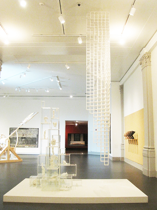
My immediate thought was “Why?” — Why muddle the installation of this Sol LeWitt by juxtaposing it with the other work? So I read the label (sorry about the skew).
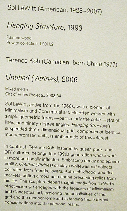
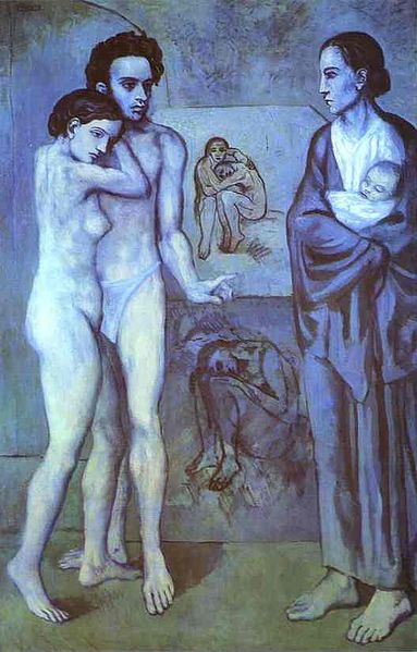
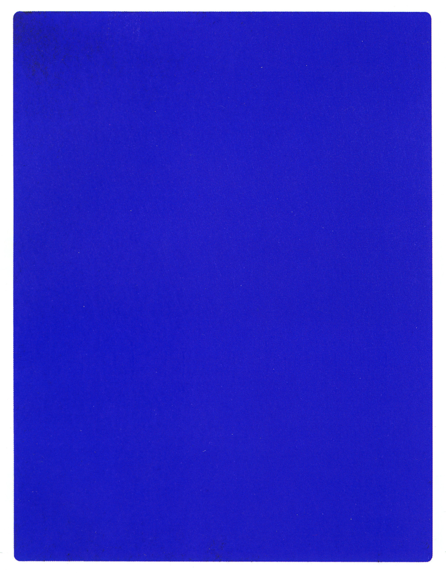
So, someone has decided that it is important to point out that two fundamentally unrelated objects are different. To do that they make it impossible to really experience either one. I’ve tried to figure out how I really feel about that and I think I’ve decided that it just seems naive, like the work of an undergrad art history student who might point out the difference between Picasso’s use of blue in his Blue Period works (La Vie, 1903, Cleveland Museum of Art) and Yves Klein’s use of blue in his International Klein Blue works of the 1960s.
The point for me is that the difference between a grid as structure and irregularly stacked boxes (not a grid) as shelving is about as far apart as the difference between cool colors conveying emotional meaning and a color chosen as a conceptual tactic. So far apart in meaning as to be meaningless.
The artworks are not served by this clumsy comparison, and the viewer is not helped by trying to force meaning out of coincidence.
