It has taken me awhile to get around to seeing Nepenthes, the four pieces in the Pearl by Dan Corson. I had seen pictures of them back when they were installed, but it wasn’t until one afternoon a couple months ago that I first noticed one of the pieces as I was turning the corner around Contemporary Crafts. It was only recently that I saw the pieces at night.

I’ve been puzzling about what I think of them. There’s something “OK” about them and yet they seem problematic.
I looked for some published thoughts about them and I found what I take to be an attempt at art criticism by Richard Speer—a rant sans analysis about the work. Here’s an excerpt:
July 3rd, 2013 RICHARD SPEER
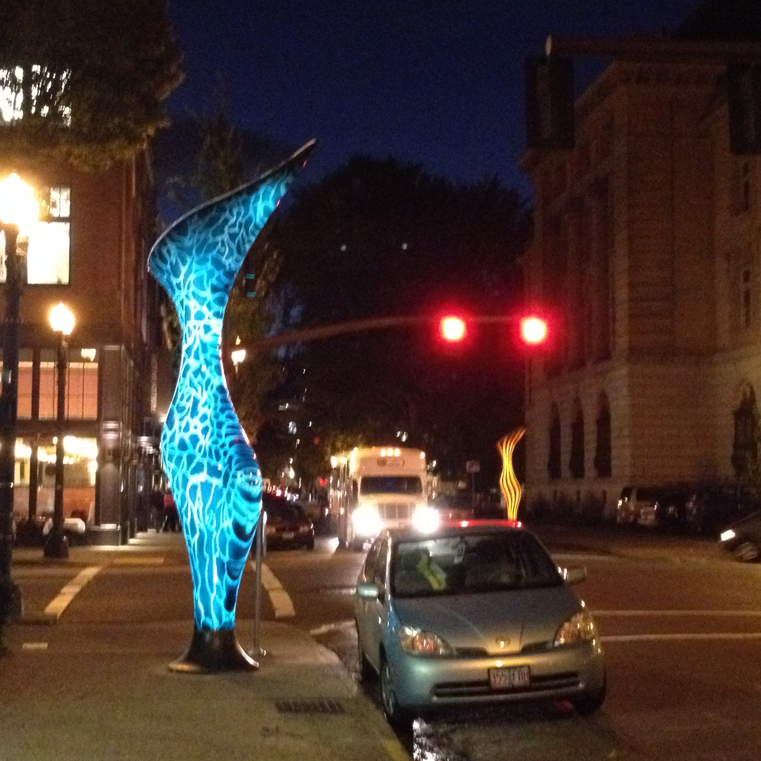
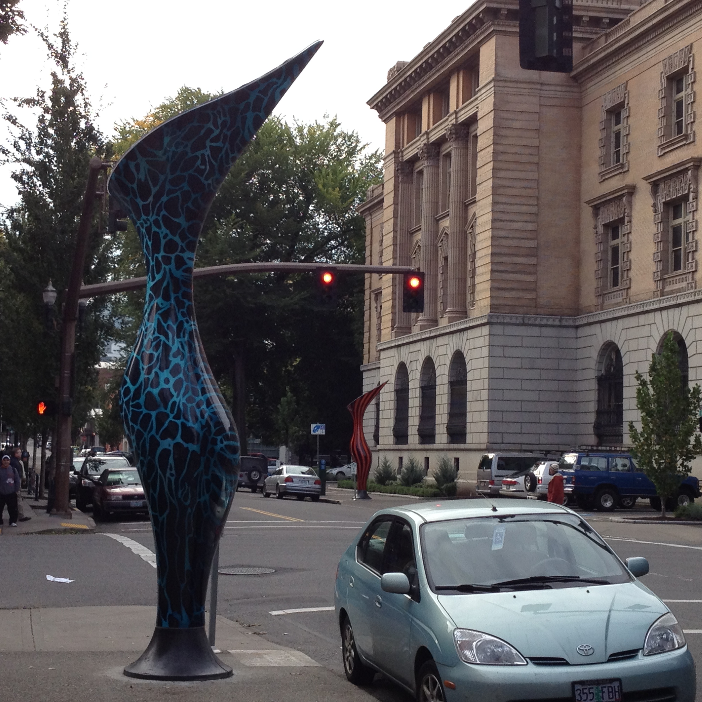
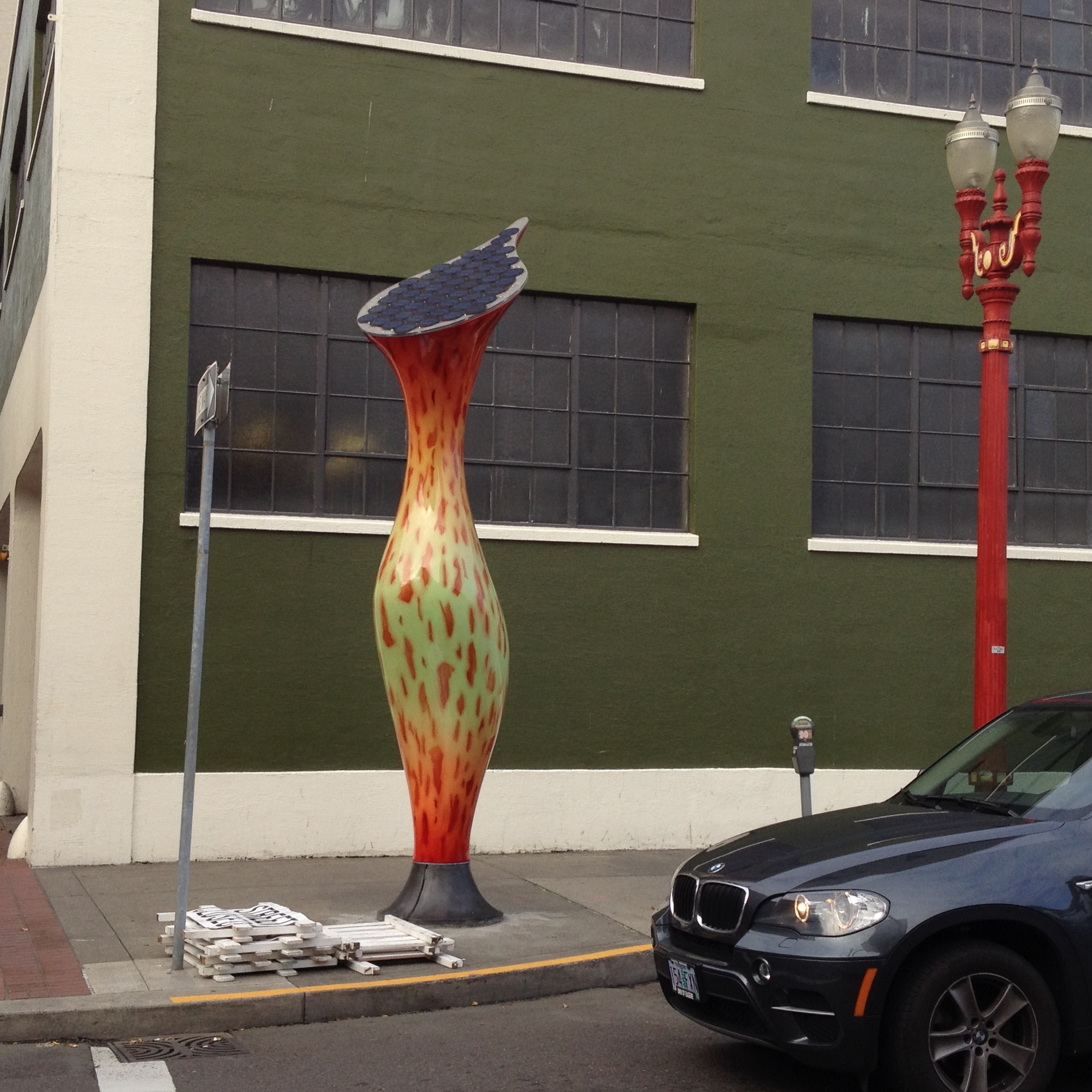
First, the atrocity: Dan Corson’s four-sculpture series, Nepenthes, installed along Northwest Davis Street in Old Town between 5th and 8th Avenues. Nearly 17 feet high, these bulbous eyesores are based on the nepenthe, a carnivorous tropical plant that eats insects, lizards and small rodents. Garish and cheap-looking, the sculptures could be props in a high-school staging of The Little Mermaid. In an outlet mall in Kissimmee, Fla., they’d fit right in. In the Northwest, they come across as dumbed-down knockoffs of Chihuly glass. At nighttime, when you wish they would disappear, the damned things glow in the dark thanks to photovoltaic panels.
One of Corson’s sculptures is only paces away from the entrance to Butters Gallery, a longtime Old Town fixture. Immediately after the piece was installed, creative director Jeffrey Butters took pains to distance the gallery from Nepenthes in a Facebook post that read: “UGH! Please know we were neither consulted nor involved in this debacle.” In person, Butters expresses his disdain even more colorfully. “I wish someone would run over them with a truck,” he says. “Everyone I know who’s seen them is basically throwing up. I want to put a sign on them that says, ‘Hey, the 1970s called, and they want their lava lamps back!’” [http://www.wweek.com/portland/article-20854-nepenthes_and_inversion_%2B__.html]
Oddly, some of the above gave me focus for my thinking. Speer says “the atrocity.” That would be “a highly unpleasant or distasteful object” according to my dictionary. These pieces don’t strike me as unpleasant. Could be that they are a bit too pleasant, not challenging enough, maybe. Maybe too tasteful (but then what is “taste?”). And if that’s how I’m seeing these pieces, they can’t be “eyesores” to me because they don’t fit my concept of “ugly.” They can’t be both overly pleasant and ugly. They aren’t aggressive or clumsy. They attempt to be graceful in a plant-like way (that’s the artist’s intention as I understand it). In that they are very unusual for big sculpture.
Then I consider whether these works are “garish and cheap-looking.” Garish: obtrusively bright and showy. Well, they don’t seem any more bright and showy than the cars on the street. It is hard to tell what is bugging Speer. Maybe they would be better matte black?


This one above is no more garish than the streetlamp. I know that Clement Greenberg hated it when sculpture was painted in colors, but these be post-modernist times. And “cheap-looking” is a meaningless term, so that doesn’t help.
Aside: It is common for those not really involved in art to feel they are saying something meaningful by comparing an artwork to something they find unworthy, for example: “That looks like a pile of junk” (Think John Chamberlain, Richard Stankiewicz). Other examples: “the sculptures could be props in a high-school staging of The Little Mermaid. In an outlet mall in Kissimmee, Fla., they’d fit right in. In the Northwest, they come across as dumbed-down knockoffs of Chihuly glass”, “the 1970s called, and they want their lava lamps back.”
Aside aside: I am reminded of a story about one of my art history profs. He was at an exhibition opening. Someone asked him about what he thought of the work. He wasn’t complimentary. The person said, “Well, I think it is pretty clever, don’t you?” He replied, “I thought this was an art show, not a clever show.”
SOOOOO…My thinking is that the context is wrong. They do not live well on the sidewalk, especially in the muddle of Pearl/Chinatown. They would do much better in a plaza or garden. They need space and now they are inhibited by signposts, street lamps and parked cars. All of those things inhibit seeing the work clearly in the same way that static inhibits hearing music on the radio.
That being said, they also function as big decorative sculptural objects, as street jewelry*. They do not bring up the “meaning” function of sculpture (for me).
And they don’t make me froth at the keyboard. Or cringe as I walk past them. I can live with them. As they are now, I find them OK.
Back in 1975, when Don Judd had a big minimal installation at Portland Center for the Visual Arts he said to me at the opening, “the problem with installations is that by the time you finish it it is too late to change anything.”
Same with public art.
* Fancy jewelry would not be appropriate with your grubby work clothes and maybe this street jewelry doesn’t function well in the grubby streets where it is.