PAM INSTALLATION…and furthermore

Thanks to everyone who looked at and commented on the previous post about the mis-installation of the Irwin disc

The point was clearly noted by Chloe Eudaly who said, “I’ve wondered about that very painting! Not being familiar with the artist I have to say that I’ve found it pretty confounding. I’d love to see it properly installed!” Indeed, seems to me that the point of being an art museum should be to educate, not to confound.

The mis-installation of art is rarely as big a problem as the outright lie of the Irwin installation, but the contemporary galleries have several obvious examples of art installed in goofy (in the bad sense) ways. How is the installation important? The same way that a properly tuned piano is important to hearing a Beethoven sonata. We want the music to be in tune and well played. We want the art to be shown to its best advantage so that it can be most effectively received.

Jeff Jahn was kind enough to mention the Irwin post on PORT  (portlandart.net). He said, “It is true, that presentation of one of the best pieces in the collection IS horrendous (a hangover from the still overcrowded Buchanan era install that needs thinning and more sensitivity). Installed correctly (as it once was) it is a stunner.” He goes on to note, “The over-installed nature of most of the museum’s collection is a MAJOR drag on the reputation of an otherwise rapidly improving modern/contemporary program at PAM …Can we fix this? This sort of thing is what many design professionals in Portland consider a major turn-off at the museum. PAM’s Jubitz Center is due for a major reinstall.”

Jahn notes that the space is “overcrowded.” I agree. The galleries are difficult because contemporary art requires generous space. Given that there is little generosity in these awkward galleries crammed on the side of the old lodge building, extra effort needs to be made to allow the art to work effectively.

One might argue that it is better to see more pieces, but I would say that it is better to have fewer unabridged volumes of literature on bookshelves than it is to have a lot of “works” in Readers Digest Condensed Books versions. The full experience is a better experience.

Here are a few problems:

The old painter’s saying is: Sculpture is something you trip over when you step back to look at a painting. Maybe the incident below is a sculptor’s revenge—Painting is the thing on the wall that serves as a backdrop for sculpture.

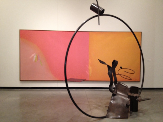
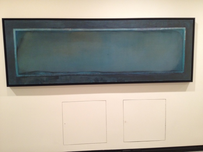
The big painting below, by Larry Poons,  is of the type that one should first be able to experience fully from a distance. Unfortunately the Michael Todd sculpture is within about seven feet of the painting.  (The photo is misleading. The painting is probably at least 15 feet wide.)

IMG_0535

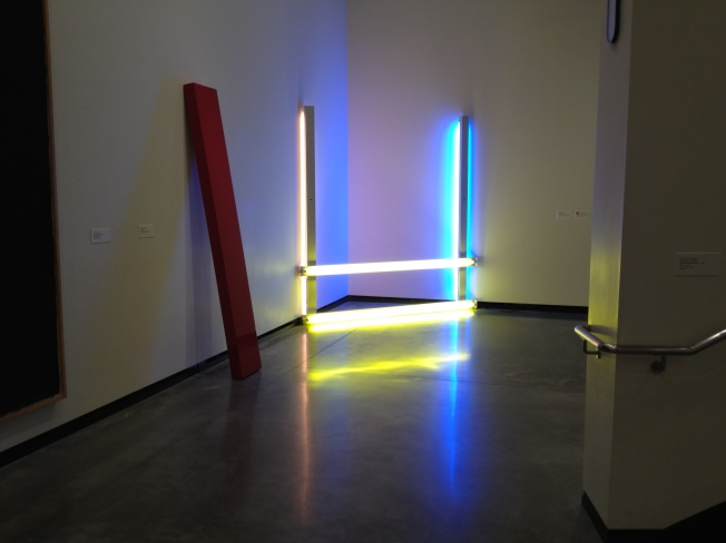
Dan Flavin’s work requires breathing room, a sense of space. Here is is crowded by the John McCracken* plank. (But note: At least all the fluorescent tubes are there and working!)

IMG_0543

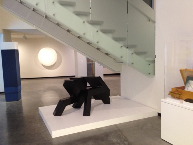
The space under the stairs might be a place for storage in a home, but not a site to display art.

IMG_0542

If you want someone to ignore something, change the subject. Don’t repeat the motif:

IMG_0549___________________________________________________________________________________

*One of John McCracken’s planks has my all time favorite title: There’s no reason not to

I also like DeKooning’s Rosy Fingered Dawn at Louse Point (and the painting itself is pretty nice, too).

VANDALISM at The Portland Art Museum

Robert Irwin is one of my favorite artists.

When I was a student at Portland State back in the early 70s Mel Katz brought Irwin to PSU. He sat in the life drawing studio and talked for several hours. A few years later I saw one of his scrim installations at the Henry Gallery at the University of Washington. I thought it was amazing. He did a very minimal installation at Portland Center for the Visual Arts in 1978. As the art critic for Willamette Week at that time I had a nice conversation/interview with him at the Burger King that used to be at Burnside and Broadway.

Irwin is an artist whose attitudes about seeing have led me to be very conscious of everything within an artwork’s visual environment. He has always been very careful about how his work is installed. I believe that everything he does has “intention.” Everything has been considered and attended to.

So, for years I’ve been ticked off by the idiotic installation of one of his disc paintings at the Portland Art Museum. For me it amounts to vandalism.

In the late 1960s Irwin made a series of  paintings on round convex panels. With these works, according to Lawrence Wescher in his wonderful book on Irwin titled Seeing is Forgetting the Name of the Thing One Sees:

Irwin was trying to create a painting that would simply dissolve into its environment. And whereas some artists (including Irwin himself at an earlier period) had long been concerned with lighting—eager that it not distract from, indeed that it enhance the presence of the painted image—Irwin was now concerned with light itself as an integral part of the aesthetic moment.

Further on Weschler quotes John Coplans from the 1968 catalog for the exhibition of these works at the Pasadena Art Museum:

…each of Irwin’s new paintings is dependent on the use of its ground…a flat gray tinged wall approximately 12 feet high in a suitably sized room or gallery. The wall needs to be at least 12 feet wide, but if possible it should be wider…The disc is cross-lit from four corners by incandescent lamps (two in the ceiling and two in the floor, placed equidistant from each other and approximately six feet back from the wall)…and the effect of the cross-light is to cast a clearly discernible, symmetrical, but elaborate shadow  pattern of segments of a circle…The result of the cross illumination combined with the ambient light is the that the shadow, the disc and the outer area of the illumined wall are seen as an entirety. Thus the three elements—wall, shadow, and painted disc—are equally positive; the shadow, in fact , sometimes becomes almost more positive than the disc.

So this is how the installation of one of these pieces is supposed to look (perhaps a little too much contrast in the pic):

tumblr_li2vs2tN1F1qbiffuo1_400


Or from a distance:

299713483irwin_gallery_450

(Thanks to

blog.robbiecooper.org/2012/06/12/robert-irwin-technology-of-painting-part-2/)

But at our Portland Art Museum the work is obviously misunderstood as “just another painting” and hung like just another everyday painting:

IRWIN IMG_0540

Perhaps they just don’t know any better. Perhaps nobody at the museum has every seen one of these Irwin disc paintings before, or flipped through Google images of Irwin’s work, or saw the original first installation of this work at the museum after it was acquired (it was given really nice space and lit correctly). Or maybe nobody from the museum was at this talk  at the museum by Ethan Rose:

Go to about 6:15 in the video where Rose says,”There’s a slight issue here in that this piece isn’t mounted exactly to Irwin’s specifications.” He goes on to discuss the lighting.

Weschler says,”Shown correctly, Irwin’s discs are otherworldly. They seem to float ambiguously. Is the disc seeming to dematerialize or the shadows taking on volume? There is an eerie, fluid sense of density, object and shadow playing in and out of copresence.”

Well, that can’t happen with this installation at PAM. For the viewer who doesn’t know better the installation is a lie about the work of Robert Irwin. How can one learn about contemporary art when they are shown a vandalized version?

According to our friend Wikipedia:

Since 2000 Bruce Guenther has served as the Chief Curator of the Portland Art Museum in Portland, Oregon as well as its curator of contemporary art.In addition to administrative duties, Guenther is responsible for initiating and planning all exhibitions and permanent collection presentations of modern and contemporary art.

So, if I put two and two together, I’d have to say that Bruce Guenther is responsible for this—if he is responsible for…all…permanent collection presentations of modern and contemporary art.

I’d be disappointed if he wasn’t aware enough to know about Robert Irwin’s intentions with his disc paintings.

But that must be the case because I just don’t see how one could ethically knowingly misrepresent the work of any artist.


NY Times: Bad Headline/Likes Portland

How Good Does Karaoke Have to Be to Qualify as Art?

That’s the headline at http://www.nytimes.com/2013/01/20/magazine/portland-karaoke-scene.html?pagewanted=all&_r=1&

Back when I was the art critic for Willamette Week (1974-1983) I didn’t write the headlines for my articles, so I can’t blame Dan Kois, the writer of the article itself, for the idea that something must “qualify” to be art. Nowadays we all know that anything considered in the realm of art is art and nobody seriously involved with art worries about whether something is or isn’t— just how  it works, doesn’t work, moves us, irritates us or maybe really just isn’t worth considering. “Art” is an attitude in the mind of the viewer.

On the other hand, the article in the NY Times  (from January 17) is a fun read about Portland’s intense karaoke scene. Not something I knew anything about, homebody that I am. But Kois does a great job of giving more evidence that Portland is coooooool.

Helpful Hint #1

SOAP THE SCREWS

Yesterday, as I was assembling some new shelving from IKEA, I ran into what seems to be a common problem with IKEA assembly: too tight fit for the screws. I’m talking about the predrilled holes in wood (or wood product) items being just a wee tad too small.

This really is a problem as the IKEA screws tend to be cheap and soft, so it is really easy to strip out the screwdriver slot (or phillips-style slot) in the screw head even if you have the properly sized screwdriver.

So, before you try to drive the screw, apply soap to the screw threads. You can use either liquid or bar soap. I think the bar soap works best—scrape the screw on the bar.

This will make the driving MUCH easier.

I’ve been surprised in the past by how many folks don’t know this little trick. Hope this helps.

Robert Rauschenberg – A Video, some thoughts

I came upon this very short video of Robert Rauschenberg speaking about some of his very early work  through a link on the Robert Rauschenberg Foundation Facebook page:

http://www.sfmoma.org/explore/multimedia/videos/36

I was particularly struck by this line:

This particular group of works were somehow sort of the the icons of eccentricities and exceptional in the sense that they didn’t fit into the art world at that time.

I did them to see how far  you could push an object and yet it still mean something. 

Of course Rauschenberg was influenced by his friend John Cage who said…

The first question I ask myself when something doesn’t seem to be beautiful is why do I think it’s not beautiful. And very shortly you discover that there is no reason.

There is, of course, a difference between “meaning” and “beauty,” but I believe there is a connection in attitude between these quotes. For Cage the thing under consideration can be beautiful through the attitude of the viewer. Rauschenberg is talking about daring to present something perhaps “eccentric and exceptional” to test the possibility that there is not only “beauty” for those with the right attitude, but also “meaning.” Finding pleasure in the viewing is an experience of  “beauty,” while sparking thought (which might or might not include the verbal) or a “gut level” reaction (thats a kind of thought, too), has meaning.

While at the Residency looking through the dozens of books, I was struck again by Rauschenberg’s Cardboards series from the early 70s.
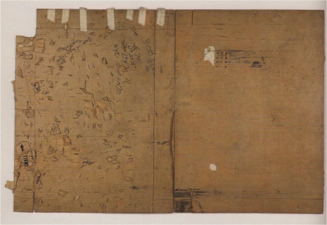
robert_rauschenberg_castelli_small_turtle_bowl1332726775806

Small Turtle Bowl (Cardboard), 1971, 94 1/2 x 145 in.

This series is essentially constructed from found cardboard boxes. I probably became aware of them right around the time I left college (1972). Must have seen Small Turtle Bowl when I went to San Francisco in 1977 to see the Rauschenberg retrospective, but I don’t remember it.

What strikes me now is the difference between the artist who made work in his early twenties to,”see how far  you could push an object and yet it still mean something,” and the artist in his mid-forties who chose to select some of the most modest remnants of our culture to present, with seemingly little modification (well, a lot of extra staples on the left side above), in the context of art. In these I detect  a sureness of knowing that these works would succeed with meaning. (However, they seem to have had less success with gallery sales according to Mary Lynn Kotz in her excellent biography of Rauschenberg.)

In design there is the concept of using poor materials richly or rich materials poorly. In the early 50s Rauschenberg had made paintings with gold leaf and with dirt, testing the possible “art” difference between the rich and poor materials—is there more meaning in gold than in dirt?. (BTW, you know, expensive oil paint is just “dirt” and oil.)

In the cardboard works Rauschenberg takes poor materials and assembles them to have dignity. Sure, he used a lot of used materials before and after, but with a lot of those remnants there is the possibility of feeling that the material previously had an important use—the bicycle had been ridden, the bed had been slept in, the crumpled metal came from some once really useful object, the goat once walked the earth. But these boxes were just the things the important stuff came in.

Again Rauschenberg asked the viewer to take notice of the real world.

Somewhat of a digression, but related:

There is a great art documentary titled Painters Painting (1972) by Emile de Antonio (highly recommended, DVD available on Amazon for $18.93, book transcript [edited] also available). In this film Jasper Johns tells the following story about his sculpture Painted Bronze, 1960:

I heard that Bill de Kooning had said about Leo [Castelli], with whom he was annoyed over something, “That son of a bitch, you can give him two beer cans, and he could sell them.” 

At that time I had made a couple of sculptures. I’d made one or two of a flashlight and one or two of a lightbulb. They were small objects, sort of ordinary objects. When I heard the story I thought, “What a fantastic sculpture for me. I mean, really, it’s just absolutely perfect.”

So I made the work. It fit in perfectly with what I was doing. I did it, and Leo sold it. [Johns laughs uproariously.]

6a00e54f0014bd8834013485ef2758970c-800wi

These are common objects reproduced, not actual cans. Made of more precious metal than the original cans. Bronze signifies “art.”

Rauschenberg’s use of cardboard reminds me of the Japanese concepts of wabi and sabi. According to our friend Wikipedia:

Wabi-sabi (?) represents a comprehensive Japanese world view or aesthetic centered on the acceptance of transience and imperfection. The aesthetic is sometimes described as one of beauty that is “imperfect, impermanent, and incomplete”.

And as Daisetz. T. Suzuki says in Zen and Japanese Culture, “Wabi really means ‘poverty,’ or, negatively, ‘not to be in the fashionable society of the time’.”  Suzuki also points out that, “This has been one of the tricks of Japanese artists—to embody beauty in a form of imperfection or even of ugliness.”  The beauty of imperfection, or the beauty of ugliness. Or as Cage says above, there is no reason that anything is not beautiful.

So, Rauschenberg’s rescue (reuse, recycling) of these poor, far from perfect, cardboards might be considered as a demonstration of the idea that anything, well presented (and that is important!), can be meaningful, and beautiful.

And these pieces of cardboard were pushed further in multiples such as  Cardbird door, 1971:
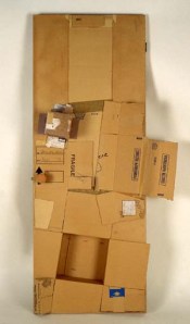
80_189


Where the original cardboard pieces are reproduced in cardboard . And they are reproduced in clay:
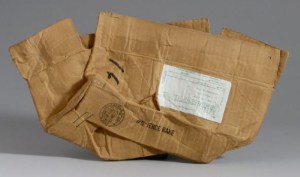
6a00e54f0014bd8834015431fa6003970c-800wi


Tampa Clay Piece #4, 1972, electric fired stoneware

Clay is the most modest of all classic sculpture materials. I enjoy this thinking which must be something like,”What can we make with all the technical resources of contemporary clay sculpture? I know, how about an old crushed cardboard box???!”

I feel that Rauschenberg had gotten to a point where he knew that very little needed to be done with a material, an object, a subject, in order for it to have some meaning. How much meaning? I’m thinking that that could be a point (not necessarily Rauschenberg’s conscious point, but a point that I’m feeling)—maybe a little bit of meaning, a teaser of meaning, is enough meaning to get us to connect—with the artwork, with the world, with a random cardboard box sitting on the floor once in a while. The Cardboards/Cardbirds/Clay pieces, even when they are large, might just be etudes, not symphonies.


PS: In transformation from one material to another I saw this piece (or one similar, evidently there are variations) over 30 years ago and in terms of modest subject to rich materials this takes the cake:

TP_02


Portrait of Toilet Paper, by Jud Nelson, carrara statuario marble


PPS:

What about Marcel Duchamp? I don’t find Duchamp relevant to Rauschenberg’s work in general. Certainly Rauschenberg knew Duchamp. But there is a difference in attitude between Duchamp and Cage. Cage said,”Beauty is now underfoot wherever we take the trouble to look.” Duchamp’s attitude was more of  “it’s art if I say so.” Rauschenberg wasn’t trying to see if cardboard could be art, but rather how to make art with cardboard.


PPPS:

This kinda relates to the quote in the beginning, but it is 25 years earlier. In Painters Painting Rauschenberg says:

I was the “charlatan” of the art world. Then, when I had enough work amassed, I became a “satirist”—a tricky word—of the art world, then “fine artist, but who could live with it?” And now, “We like your old things better.”
 

Rauschenberg/Jobs—Art/Design—Musings

After returning to Portland from a wonderful four weeks in Captiva at the Rauschenberg Residency I keep being reminded of Robert Rauschenberg.

I received Walter Isaacson’s biography of Steve Jobs for Christmas. I just finished reading it. Near the end there is this anecdote in which Jobs recalls a visit to a Turkish Bath in Istanbul:

I had a real revelation. We were all in robes, and they made some Turkish coffee for us. The professor explained how the coffee was made very different from everywhere else, and I realized, “So fucking what?” Which kids even in Turkey give a shit about Turkish coffee? All day I had looked at young people in Istanbul. They were all drinking what every other kid in the world drinks, and they were wearing clothes that looked like they were bought at the Gap, and they were all using cell phones. They were like kids everywhere else. When we’re making products, there is no such thing as a Turkish phone, or a music player that young people in Turkey would want that’s different from one young people elsewhere would want. We’re just one world now.

That reminded me of a quote from Robert Rauschenberg that I marked in my copy of Robert Rauschenberg: Travelling 70-76 (Museo de Arte Contemporanea de Serralves):

We’re going to end up with a generic world. Where everybody is going to be exactly the same…Even Africa is becoming like that…seeing everything leveled down to the same attitude is going to be most depressing. I look forward to the differences. I need them, I respect them. So, if everything levels out it will be boring. I don’t know what I’ll do for a living. 

They both perceived similar things, but Rauschenberg notes how, as an artist, he needs the richness of variety in the world while Jobs’s attitude seemed one of acceptance, a recognition that says to Jobs-the-designer that products need to be designed so that anyone, in any culture, can utilize them intuitively. Probably they are both right.

Perhaps it is a function of art to fight against the less attractive aspects of prevailing culture.

At another point in Isaacson’s book he quotes Bono:

The job of art is to chase ugliness away.

In being driven through Ft. Myers, Florida, I was reminded of the blandness of most of our corporate culture when I realized that a big box store mall I was passing through could be in Oregon instead of Florida if you just switched the palms for evergreens.

If you read my earlier posts you may recall that as I was taking breaks from studio work I was reading Anthony Everett’s biography of Hadrian (which I have just now returned to). Among other things, that  Roman emperor is credited with building the Pantheon in Rome.

Pantheon 2009

It is my favorite building in the world.

On visiting in 2009 I was disappointed to find that directly across the piazza in front of the Pantheon  (right behind me as I took the picture) is a McDonald’s.

Sacrilege.


Woody Allen/Robert Rauschenberg

I’m rereading Stuart Horodner’s book The Art Life: On Creativity and Career as I have assigned it for my class this term.

Horodner has reproduced a couple of his notebook pages in the book. One from 2005 includes a clipping about Woody Allen. Allen says:

In my regular life, I’m consumed by depression, anxiety and terror. When I’m making a movie I get to live in a fantasy of beautiful women and charming men speaking amusing dialogue. Then I return to real life, it’s a terrible time.

That reminded me of a contrasting sentiment from Robert Rauschenberg:

I really feel sorry for people who think things like soap dishes or mirrors or Coke bottles are ugly because they’re surrounded by things like that all day long, and it must make them miserable.

One makes art to escape life and the other makes art that engages life. Interesting. I really enjoy the works of both artists.

On the same notebook page is reproduced one of my favorite artworks of all time, by John Baldessari, The Pencil Story, 1972-1973. If you “get” this piece, then you can understand any contemporary art.

John-Baldessari-The-Pencil-Story-1972

Florida Holiday Décor and Rauschenberg

…Or something like that

I noted earlier that  the holiday décor in what I saw of Florida (OK, just a bit of Captiva/Sanibel and Ft. Myers) struck me as odd, as I know what real Douglas-fir trees look like (I can see them out my office window right now). The plastic fir boughs and the lit-up snowflake images on palm trees seemed bizarre.

Garland IMG_3542

It wasn’t until we were being driven to the airport in Ft. Myers that I realized what was really strange: There was no visible indigenous décor. For example: Why were the wreaths and garlands imported (visually or actually) and not made from local vegetation?

Perhaps Christmas needs to look “snowy and cold” even in Florida at 80 degrees. Maybe it is a set of cultural signs brought by the snowbirds from the north.  Maybe the “Florida” culture has no holiday imagery from its own past. Perhaps it is akin to the ancient Romans adopting much of Greek culture.

At the same time it can be seen as akin to a Rauschenberg collage.

Snowflake attached to palm tree.

Maybe that disjuncture wakes us up to questions about cultural symbols, what they meant, what they mean now, where they come from.

Rauschenberg’s work often sparks such questions, just as real life does.