Unknown's avatar

Stella + Judd: Carpeaux

Early on my attitudes about art were shaped by the thinking exemplified in Questions to Stella and Judd by Bruce Glaser (Art News, 1966* ), e.g.:

GLASER: Why do you want to avoid compositional effects?

JUDD: Well, all those effects tend to carry with them all the structures, values, feelings of the whole European tradition. It suits me fine if that’s all down the drain.

Recently I was at the Metropolitan Museum of Art  and found myself marveling at Ugolino and His Sons (modeled ca. 1860–61, executed in marble 1865–67) by Jean-Baptiste Carpeaux (French, 1827–1875). Far from the minimalist 60s values of Frank Stella and Donald Judd.

IMG_4839

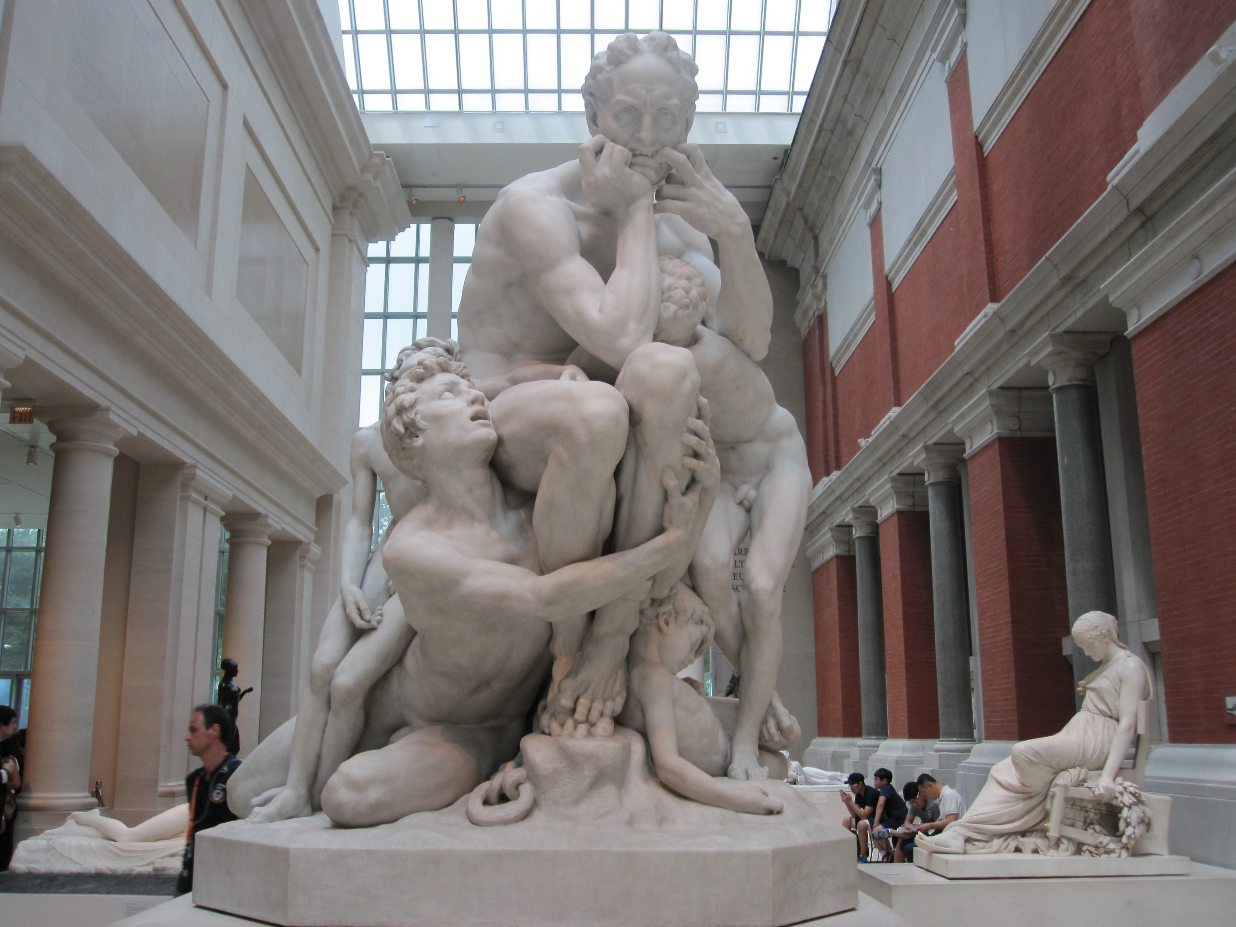
I’ve walked by this piece many times before. It was far too melodramatic for me. This time just this little detail caught my eye:

IMG_4826

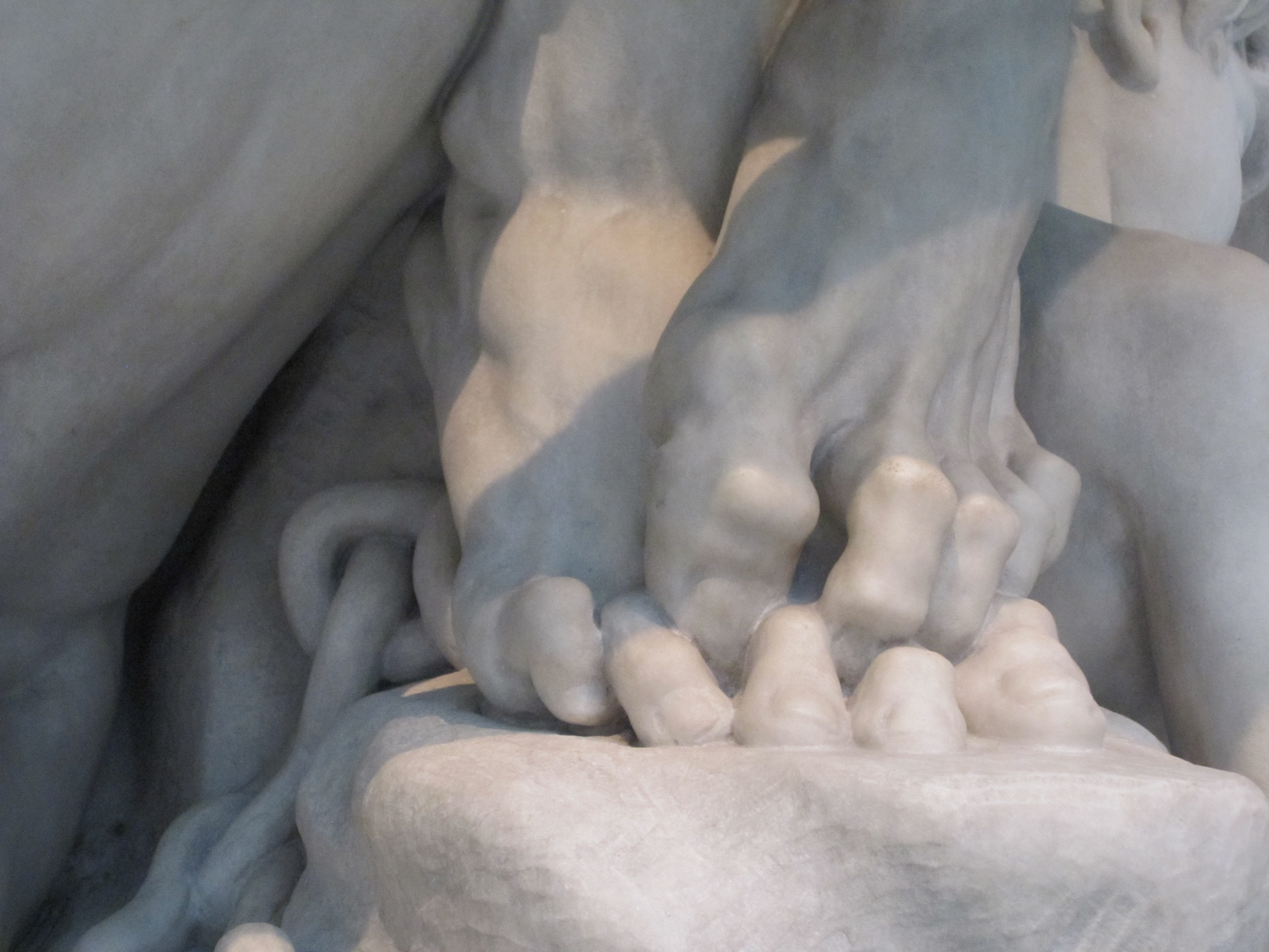
Really!?!? Interwoven toes?

Once stopped I noticed more.

Digression: Once upon a time a farmer was motoring down a country road when he came across a friend pulling on a rope tied to a mule. The mule was steadfast. The farmer asked, “What are you doing?” “Trying to get this dang mule to cross the road,” replied his friend.

The farmer reached into the back of his truck and grabbed a short length of two-by-four. He walked up to the mule, gave it strong whack on the back of the head, and calmly led the mule across the road.

“How’d you do that!?” asked his friend. “First you gotta get their attention,” said the farmer.

(Apologies to animal rights activists.)

How do these figures manage to fit together?

IMG_4838

Like a great mannerist puzzle. Look at the delicacy of the child—and yet more straining toes!

IMG_4832IMG_4831

IMG_4837 IMG_4830


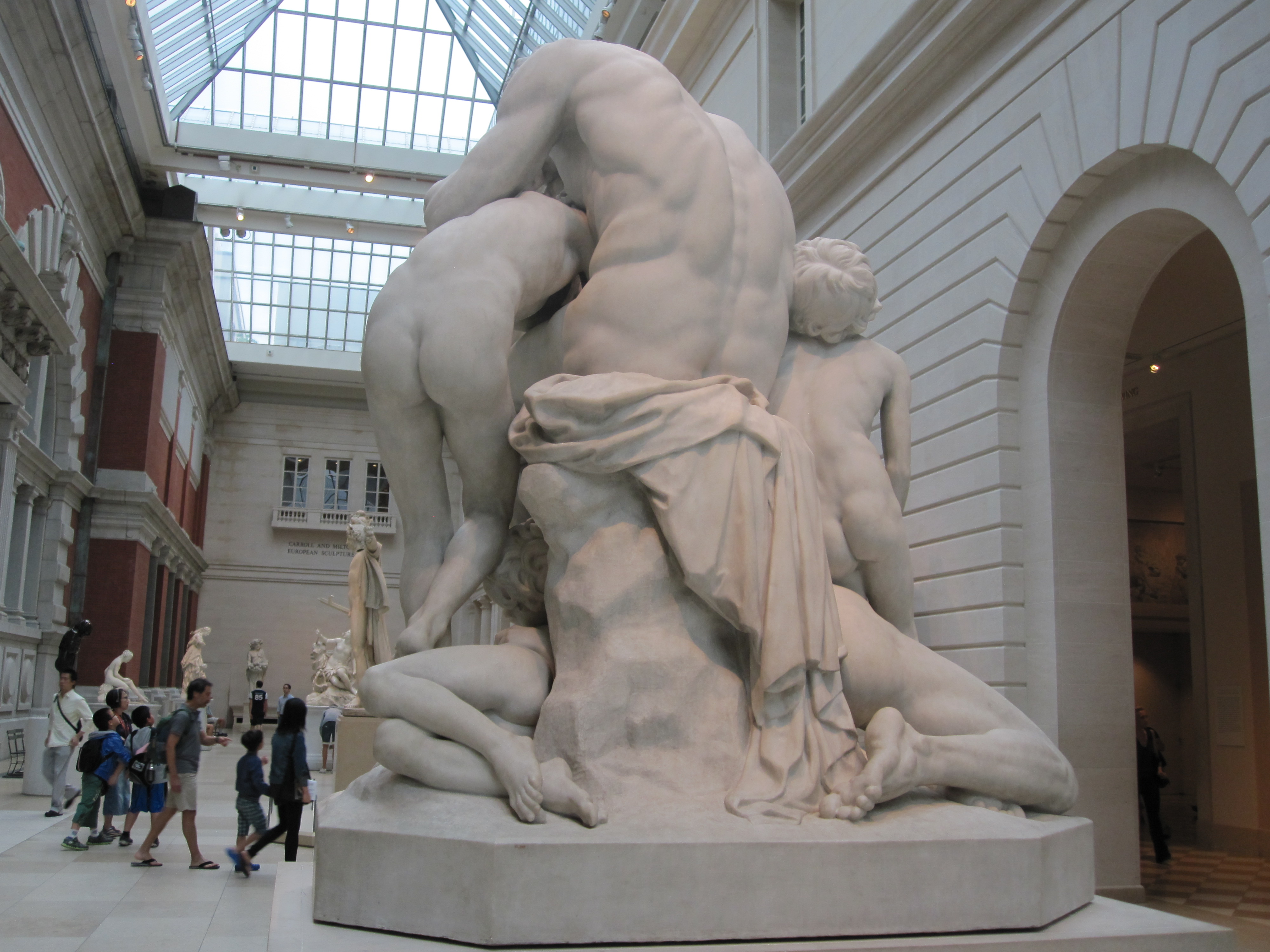
Then I noticed the hole through the whole…

IMG_4834 IMG_4835


Back to Stella and Judd:

STELLA: Maybe that’s the quality of simplicity. When Mantle hits the ball out of the park, everybody is sort of stunned for a minute because it’s so simple. He knocks it out of the park, and that usually does it.

Carpeaux is not simple. He knocks it outta the park. Very complicated. Amazing. Still sappy melodrama to me. But I’ve got to respect him as an artist.


From the Met’s web site:

H. 77 in. (195.6 cm)
Signed (incised in script at right front facet of base): Jbte Carpeaux./Rome 1860; (incised at right end facet of base) JBTE CARPEAUX ROMA 1860
Purchase, Josephine Bay Paul and C. Michael Paul Foundation Inc. Gift and Charles Ulrick and Josephine Bay Foundation Inc. Gift, and Fletcher Fund, 1967 (67.250)

ON VIEW: GALLERY 548   Last Updated September 4, 2013

Dante’s Divine Comedy has always enjoyed favor in the plastic arts. Ugolino, the character that galvanized peoples’ fantasies and fears during the second half of the nineteenth century, appears in Canto 33 of the Inferno. This intensely Romantic sculpture derives from the passage in which Dante describes the imprisonment in 1288 and subsequent death by starvation of the Pisan count Ugolino della Gherardesca and his offspring. Carpeaux depicts the moment when Ugolino, condemned to die of starvation, yields to the temptation to devour his children and grandchildren, who cry out to him:

But when to our somber cell was thrown
A slender ray, and each face was lit
I saw in each the aspect of my own,
For very grief both of my hands I bit,
And suddenly from the floor arising they,
Thinking my hunger was the cause of it,
Exclaimed: Father eat thou of us, and stay
Our suffering: thou didst our being dress
In this sad flesh; now strip it all away.

Unknown's avatar

Brooklyn Museum

Last month I visited the Brooklyn Museum for the first time.

I finally saw Judy Chicago’s  The Dinner Party which turned out to be appropriately great. There was also an exhibition of quilts, “Workt by Hand”: Hidden Labor and Historical Quilts, also terrific , which reminded me that 100+-year-old quilts often seem strangely post-modern.

But the thing that I’ve been puzzling about for a few weeks was this installation:

LeWitt Brooklyn Blog

My immediate thought was “Why?” — Why muddle the installation of this Sol LeWitt by juxtaposing it with the other work? So I read the label (sorry about the skew).

LeWitt Brooklyn label BLOG

So, someone has decided that it is important to point out that two fundamentally unrelated objects are different. To do that they make it impossible to really experience either one. I’ve tried to figure out how I really feel about that and I think I’ve decided that it just seems naive, like the work of an undergrad art history student who might point out the difference between Picasso’s use of blue in his Blue Period works (La Vie, 1903, Cleveland Museum of Art) and Yves Klein’s use of blue in his International Klein Blue works of the 1960s.

383px-Picasso_la_vie international-klein-blue

The point for me is that the difference between a grid as structure and irregularly stacked boxes (not a grid) as shelving is about as far apart as the difference between cool colors conveying emotional meaning and a color chosen as a conceptual tactic. So far apart in meaning as to be meaningless.

The artworks are not served by this clumsy comparison, and the viewer is not helped by trying to force meaning out of coincidence.

Unknown's avatar

Even THE MET screws up

Last January I posted

VANDALISM at The Portland Art Museum

about how the careless installation of a Robert Irwin work at PAM effectively destroyed the work and lied about its meaning.

Last week I was at The Metropolitan Museum of Art in New York and saw this installation of Robert Rauschenberg’s Winter Pool, 1959:

RR Winter Pool

Note the goofy extension of the baseboard/floor—a plinth. I cannot find any rationale for this plinth other than the idea that because this is a “painting” it needs to be hung at a similar height to other “paintings” on the wall. And then the ladder needs something to sit on.

But there is a difference between a ladder extending to the floor and a ladder being supported by a plinth. And The Met knows it is supposed to be a floor. From their own website:

The work, in exceptionally fresh condition, consists of two separate canvases, each about the height of a man. A wooden ladder bridges the gap between them, and its legs extend to the floor, inviting the viewer to climb into the picture.

You might be “invited to climb” from your place on the floor, but less likely from a reserved space on a plinth. BTW, here’s The Met’s own pic of the work from their website:

DP157665


You can see that someone there thinks it is correct to have it be on the floor.

This isn’t as bad as the PAM/Irwin fiasco, but it does distort the meaning of the work. It’s just dumb.

Unknown's avatar

Meeting a New York artist

I had a great time in New York last week at the Fruits of Captiva opening and I met several artists from other residency groups. But perhaps the best meeting was with an artist I’d wondered about since I was at the residency. Back on December 6 I noted that

While we believe that we are the first lucky group to be “residents” here, I found something lurking beneath a work table that indicates that some other artist had been working here recently:

IMG_3718

And I finally got to meet the mystery artist who made it:

photo

Sam!

I expect more great things from him in the future…

Unknown's avatar

Fruits of Captiva

Studio 12 17 12

Tonight I’m off to NYC for the opening of the Fruits of Captiva exhibition. Last fall I was part of the first group of artists at the Rauschenberg Residency in Captiva, Florida. (Info about that in the Nov-Dec, 2012 part of this blog.)

July 12-August 18 – Rauschenberg Residency: Fruits of Captiva works from the pilot year of artists at Rauschenberg’s home and studio.

Rauschenberg Project Space

455 West 19th Street
New York, NY 10011

New York, NY – May 15, 2013 – The Robert Rauschenberg Foundation (RRF) is pleased to announce an ongoing schedule for the Rauschenberg Project Space located in Manhattan’s Chelsea art district. The Rauschenberg Project Space is owned and used by the Robert Rauschenberg Foundation to showcase unique aspects of Robert Rauschenberg’s legacy; to provide a platform for RRF grantees; or to create a link to its Captiva, Florida–based Rauschenberg Residency.

Six of the paintings on the back wall in the photo (Captiva studio shot, last December) will be in the show. (I did exhibit all the works on the wall at Nine Gallery in April. The monochromes on the table will be at Nine in October.)

Unknown's avatar

Amazing Matisse

I get to the Museum of Modern Art about once a year. My favorite gallery is lined with paintings by Henri Matisse. My habit is to choose just one of the paintings and really examine it. I always find Matisse amazing.  A few years ago I happened to choose this painting:

20100119_5466

I’m pretty sure that I never really paid attention to this modest subject before. But, as I looked I found something that was wonderfully surprising—Matisse painted what was seen through the vase before he painted the outline of the vase!

20100119_5467

Well, maybe not all of it, but a significant amount.

20100119_546920100119_5468

You can see that the line of the vase edge goes over the pre-painted background and what is seen through the “water.”

How did he conceive what was seen inside the vase before painting the outline of the vase?

How did he think?

Unknown's avatar

IMAGE + TEXT

Another purchase at Cal’s Books and Wares was this carte de visite photograph of a little girl:

Hattie A


A common pose in a nice new looking dress. The back of the card indicates that I paid 25cents for it. But there was another card with text on the back that changed the meaning of it all:

Hattie B


May, 1883—130 years ago.

Unknown's avatar

Early Photo Criticism

Thirty or so years ago I used to frequent a terrific antique/collectibles shop on SW 2nd Avenue (I think) called Cal’s Books and Wares. For a few years, sparked by what I found there, I collected several hundred photo postcards—actual photographs printed photographically as postcards dating from about 1905-1920.

Usually they were blank on the address side, or maybe they had been mailed and sent, but just with a few words of hello.

But here’s an exception that I really like because it is an early (c.1910) example of photography criticism (and an example of how we all do art criticism from time to time):

Photo Crit x2Dear Cousin:- I am up home now and Daisy took my picture. She says it looks just like me. But my hair is punched up on one side and my hand is shaded so it looks just like a claw. Then I look so sad and Jewish, but I look Jewish anyway. I’m a great big girl now and I don’t expect you would know me. I’m big enough so if I pass the teachers exam in the spring I am going to teach school next year.

What did you get for Christmas? I got a whole lot of nice things among which was just a dandy emerald set ring.

Daisy is just doing things with her camera. If you were here I just know she would take your picture.

Bess.

Unknown's avatar

The Virgule and the Slash

In the last few days, listening to the radio, I’ve heard ads where the web address includes “forward slash” or “backslash.” Neither of these specifications is necessary and one of them is wrong.

Ok, that bugs me. All you need is “slash.”

A “slash” is:  /

A “forward slash” is:  /

A “backslash” is:  \

If you actually put backslashes in the web address it won’t work (unless, as with Google Chrome, it triggers a search function that corrects the address—I tried it with Chrome, Firefox and Safari).

The fancy generic name for the slash is “virgule.” But not when you are talking about a web address.

There’s a looong fascinating article on Wikipedia about the “slash.” Learn things like: A slash denotes a spare, knocking down all ten pins in two throws, when scoring ten-pin bowling, and duckpin bowling.


and then you can go on to…


Feynman slash notation

From Wikipedia, the free encyclopedia
In the study of Dirac fields in quantum field theoryRichard Feynman invented the convenient Feynman slash notation (less commonly known as the Dirac slash notation[1]). If Ais a covariant vector (i.e., a 1-form),
A\!\!\!/\ \stackrel{\mathrm{def}}{=}\  \gamma^\mu A_\mu

using the Einstein summation notation where γ are the gamma matrices.


BTW, if you haven’t read  Surely You’re Joking, Mr. Feynman! get it for summer reading.