
I finally got to the Portland Art Museum to see In Passionate Pursuit–The Arlene and Harold Schnitzer Collection and Legacy and Blue Sky–The Oregon Center for the Photographic Arts at 40. These are very important exhibitions, both for the quality of work presented and for the great contextual information for those who haven’t been living in the Portland area for several decades.
But while the works were great to see, I was disappointed.
Both shows look gloomy. Example number one:

What is the point of the tan walls for the Schnitzer exhibition? This gallery always feels stuffy and keeping the walls medium dark just makes it worse.
And for Blue Sky, the walls are gray.
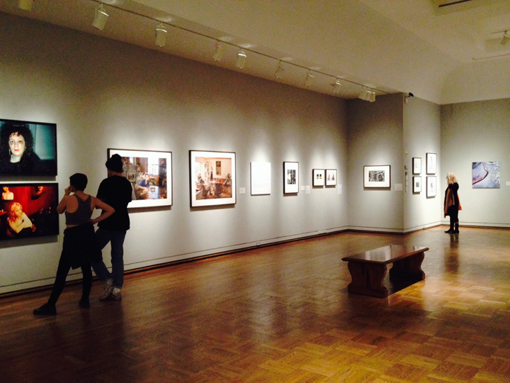
While my friend Chris Rauschenberg says that you should avoid bright white walls because, by contrast, they can make your white mats seem dingy, the gray here keeps the whole show from being bright.
When I went up to the contemporary northwest galleries, I saw bright spaces that let the exuberance of the works speak.

Spaces don’t need to be museumey. Let the work breathe.
